Trinity Apparel
Workflow Dashboard
Part 2: Orders Widget
OVERVIEW
This is part 2 of the Workflow Dashboard React rewrite. View Part 1: Omni-Search
The result of this project was an orders widget that allows Workflow users to track and monitor client orders with ease from the dashboard.
RESEARCH
We expanded the analytics and survey data collected in Part 1 with new interviews and ethnographical studies. The main conclusions were:
91% wanted to be able to monitor order statuses on their mobile phones
62% had clients cancel orders because delays were not resolved quick enough
100% wanted to hide wholesale pricing
USABILITY: Existing Orders Page
We conducted usability tests on the existing PHP orders page to find out if users actually found the page useful or if it was just a necessary evil they had to endure. Users had trouble communicating what would make the page better but thankfully, quantitative tests helped us read in between the lines.
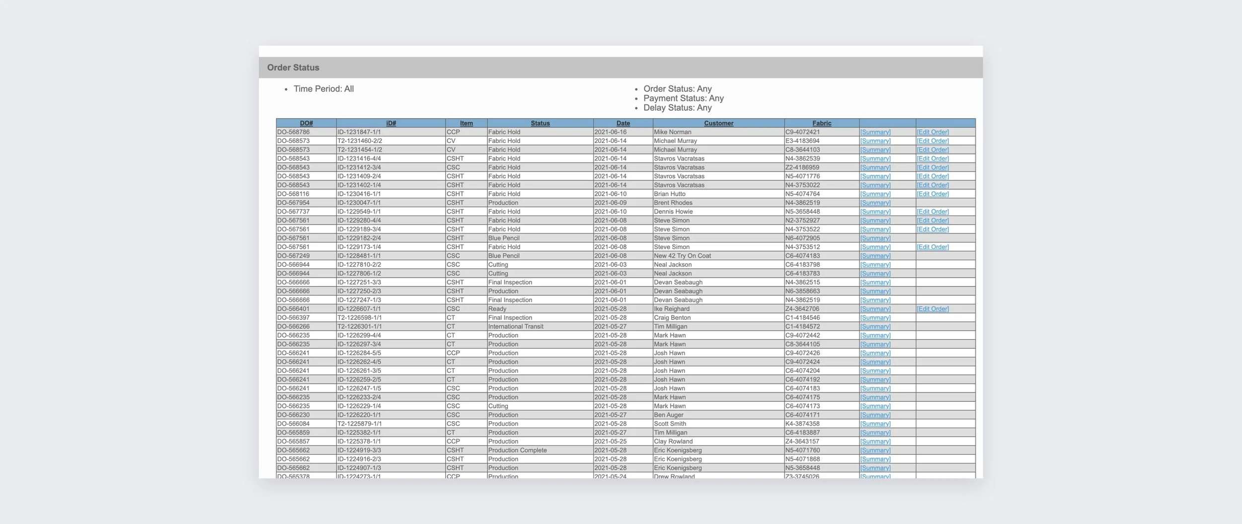
The existing PHP orders page was essentially a spreadsheet
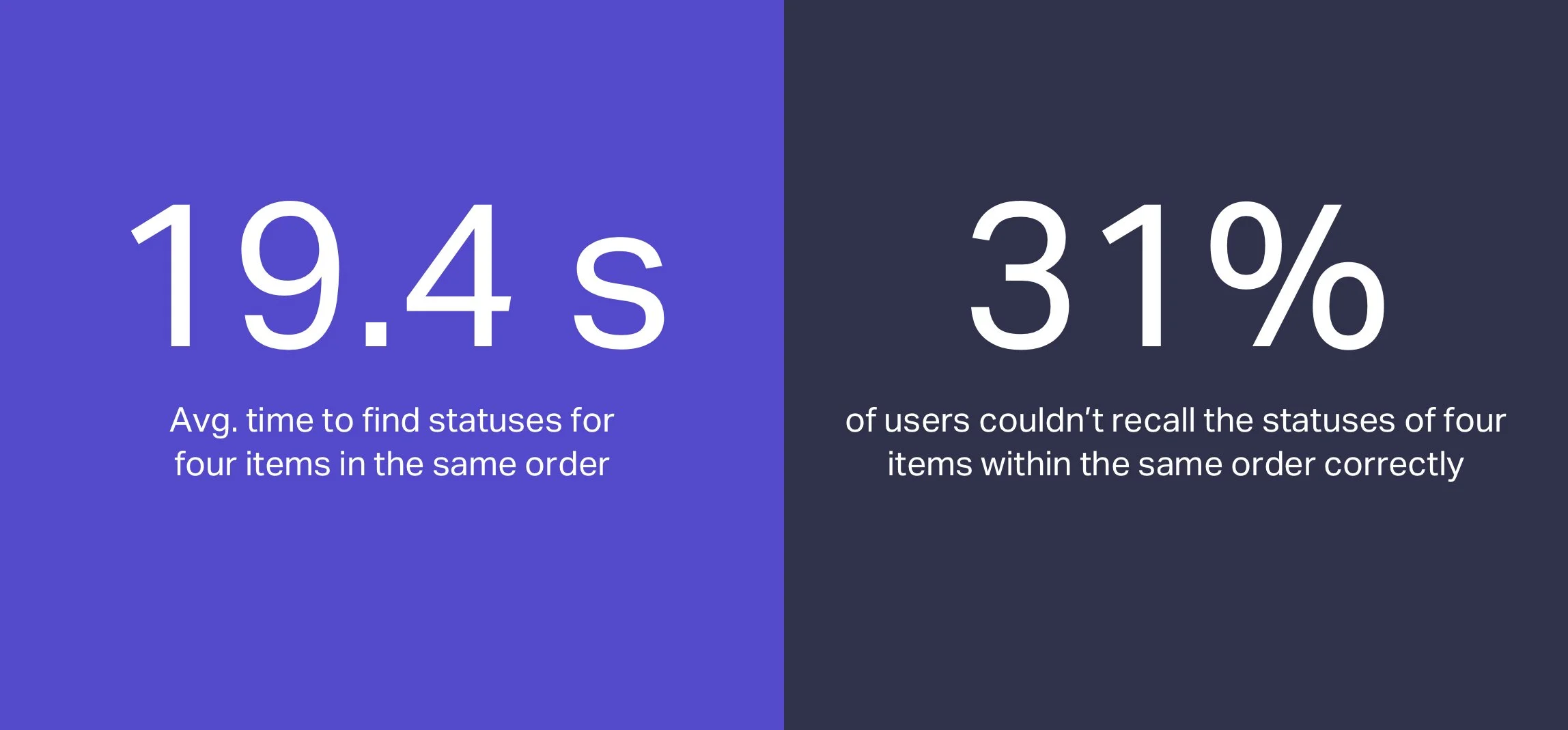
In one test, users were asked to find four items within the same order and recall their production statuses after ten seconds sitting idle. What made this task challenging was that rows (items) were auto-sorted by most recent status change and not always grouped together on the page. Users found it difficult locating all the items, often touching a pen or paper to the screen to keep their place in the table.
Usability testing with the existing PHP orders page
“It’s a lot of information hitting you at once and I just want to print the d*** thing because you can’t read it on the screen”
OBSERVATIONS: Bad Visual Design
Technically, the orders page had all the information users needed but the visual design significantly hindered usability. Small font size, lack of visual font hierarchy, and compressed row height (small top-bottom padding) were standout problems. Also, garments were represented by coded acronyms, not natural language.
CSC = Custom Sport Coat
CCP = Custom Coat & Pant
DECISION: Information Hierarchy
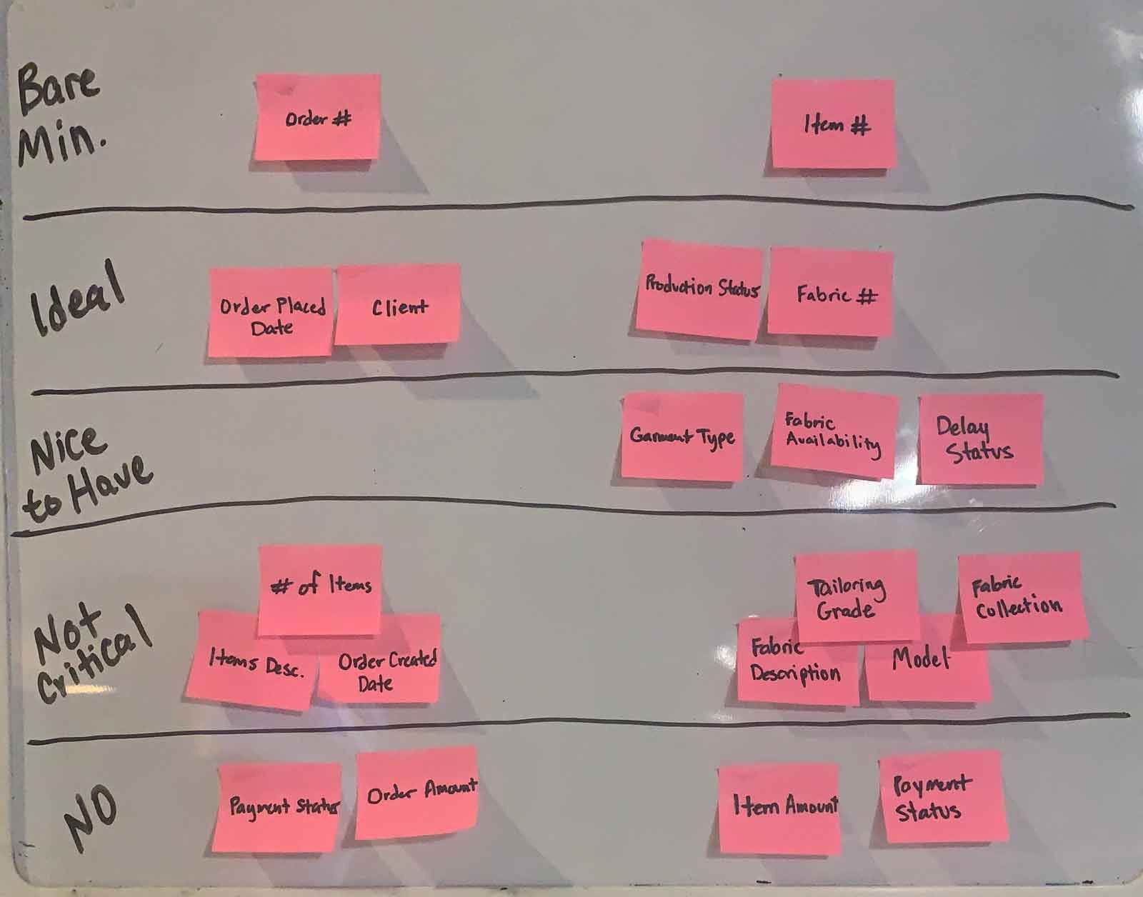
I wrote all order-related attributes on sticky notes and used card sorting to organize them by importance to build an information hierarchy for the design.
UX NOTE: Showing prices is standard UX practice for B2C e-commerce but it’s different for B2B. Wholesale sellers want pricing hidden as much as possible because they don’t want their retail customers to see what they pay for products.
DESIGN
I didn’t want to recreate the data table found on the existing orders page - we needed a pattern for viewing orders that could universally serve multiple use cases and serve future products and features. We had 3 core user goals:
To browse lots of info at once, e.g. show multiple items and their statuses
To determine and execute actions quickly, e.g. edit an order, track a shipped order, etc.
To compare information (in same view), e.g. how many items are completed versus how many are in progress
DECISION: Nested Tables
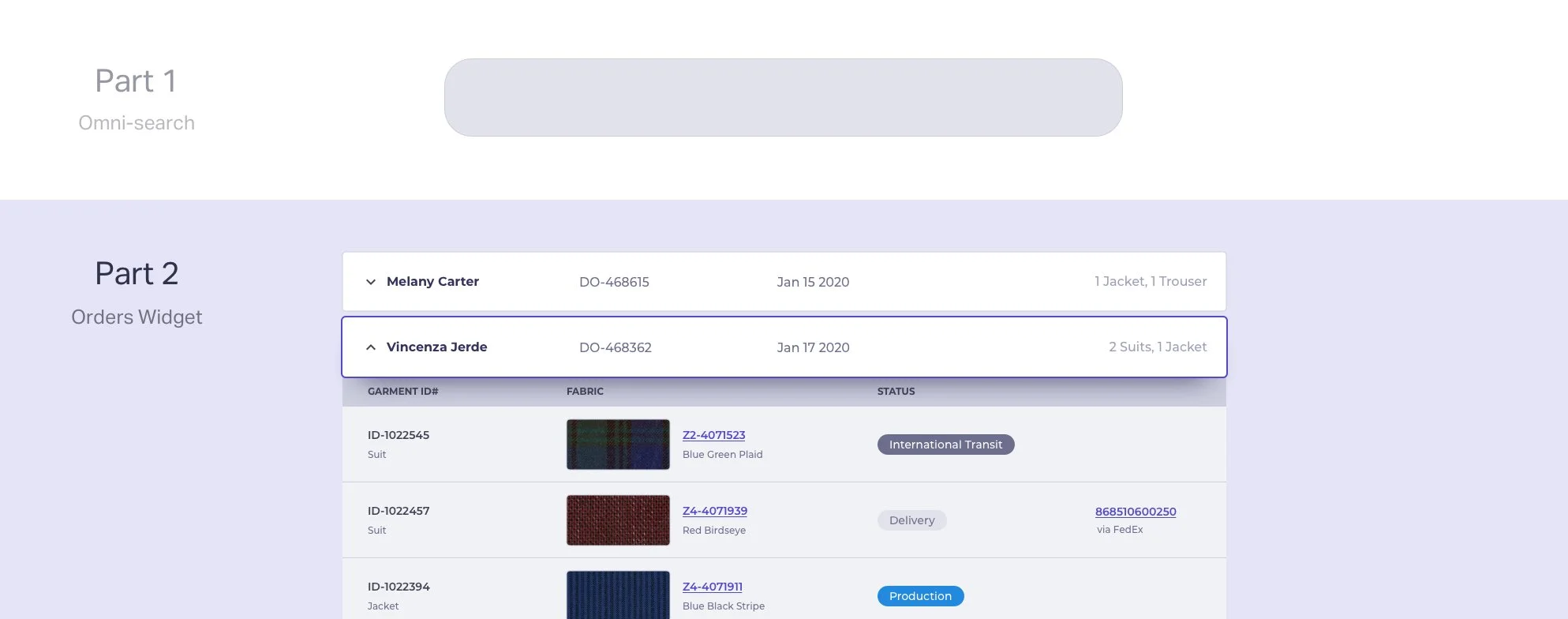
The design was meant to be informative and simple - not heavy. Items were entities within a parent order, a relationship most similar to nested tables. Nested tables helped to minimize the UI (at rest) but allowed users to dive deeper into detailed information if they wanted to.
After talking to users, we confirmed that nested tables most closely matched their mental model for orders and items.
DECISION: Active Orders
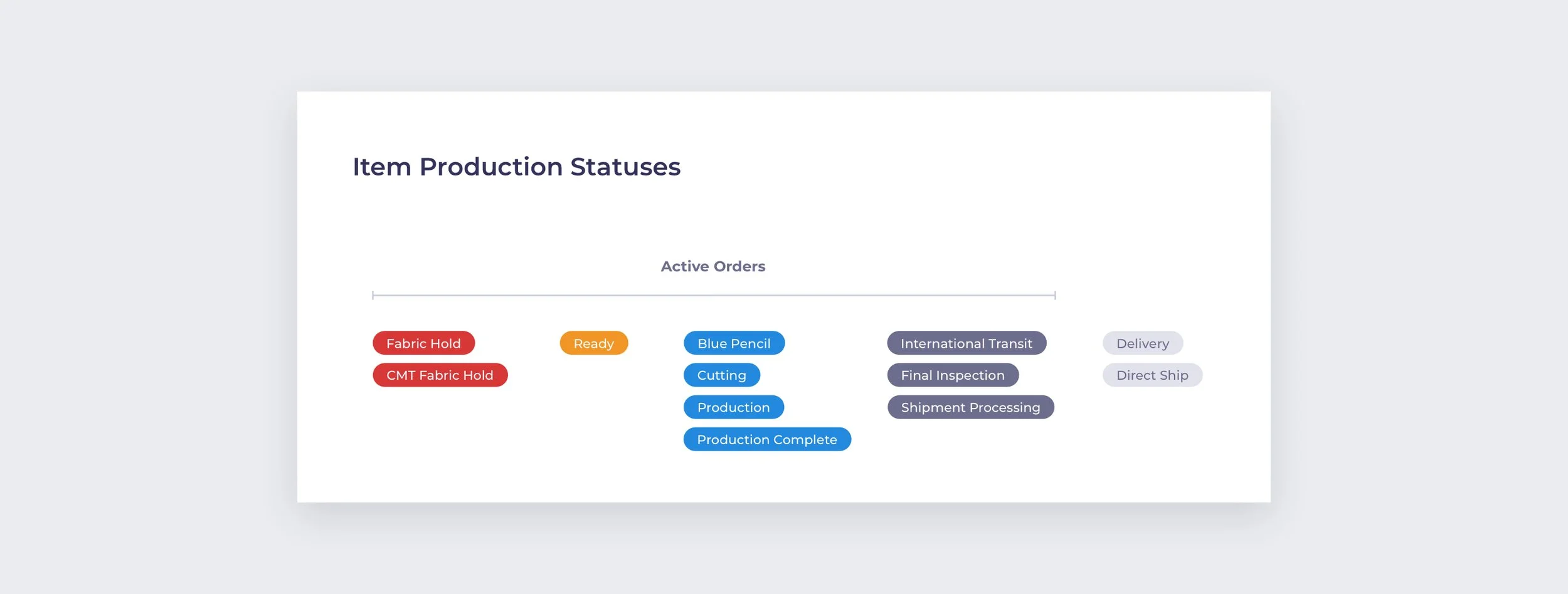
Users were more interested in monitoring orders that were in progress, not past orders where all items were in a delivery status. Production statuses are exclusive to items because they go through production independently and can ship separately. I created a new synthetic group called Active Orders for orders with items in a pre-delivery status with the idea a consolidated view would be most efficient for monitoring.
SKETCHING: Interactions and Information
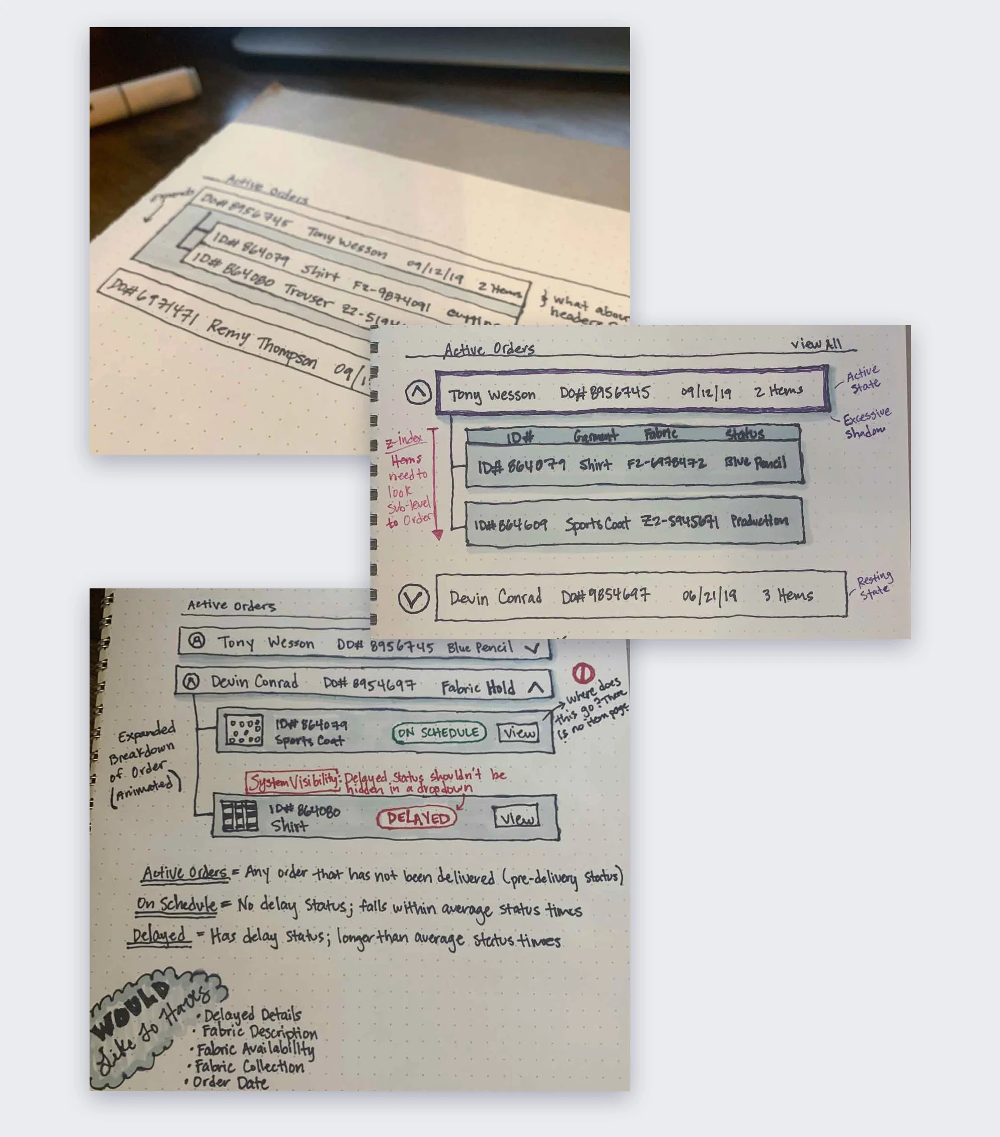
My goal was to make each parent order row to feel like an independent component yet still have table-like characteristics when at rest (collapsed). Deviating from traditional Trinity design, I started order rows with the client name instead of the order number because it made the design feel more human-centric, especially when viewing multiple orders at a time.
When clicked, the parent order row would rise up and tray-like table would slide out of the bottom containing the inner item rows. The interaction would be a toggle and multiple orders could be expanded at one time. I built an early prototype in Webflow to demonstrate the interaction to the rest of the team.
FEEDBACK: Show All Orders
User feedback on sketches changed three key design decisions:
More visibility for delays because it could mean losing a client if it doesn’t get resolved as fast as possible
Rename Active Orders to “Open Orders” because it is more inline with industry terminology
Want to see all orders, open and completed, even if it overloads the page
“It would be a game changer if you could figure out a way for me to view all my orders on my phone”
DECISION: How to Show All Orders
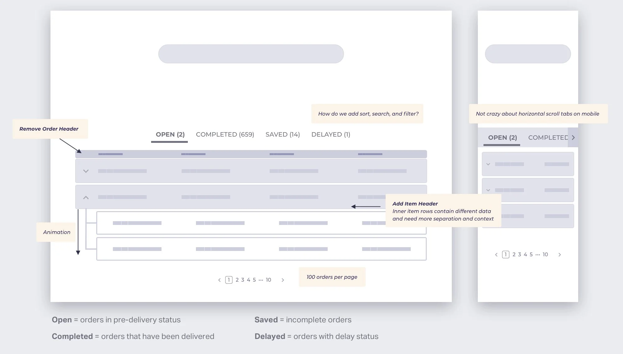
More than half of users had 1,000+ completed orders in their accounts so we needed components for navigating the data (e.g. sort, filter, etc.). Page load times were managed using tabs to show a smaller grouping of orders and pagination to cap the number of orders per page. Infinite loading was considered but it was too easy to get lost due to the variable nature of expandable components.
At this point, I moved to digital mid-fi wireframes because I wanted to see how components were going to fit on different screen sizes.
DECISION: Fixed Bottom Menu on Mobile
Delays were not immediately visible using horizontal scrolling or dropdown-select tabs on mobile. A fixed bottom menu with a badge notification improved usability and would always be visible to the user.
DECISION: Filters on Desktop vs. Mobile
Desktop
To simplify the main tab menu, “Open” and “Completed” views were combined to form a single tab, “Orders”. Then, I added secondary UI filters in the form of radio buttons for “All”, “Open”, and “Complete” to strengthen the information hierarchy and to give users finer control on desktop. Sorting options for “Newest” and “Oldest” were added on the same horizontal plane as the secondary filters.
Mobile
The secondary filter controls (radio buttons) were removed on mobile because they were visibly higher than the main tab menu at the bottom and broke the information hierarchy. Using graceful degradation, the default view was locked to show all orders sorted by most recent. Icons added visual appeal and increased the tappable menu area.
VISUAL DESIGN: Orders are Expandable Card-like Rows
Information in order rows decrease in importance moving left to right and function independently without a header. A card-like design increased the component’s affordance for touch and provided a good entry point to more complex and detailed item information. Upon activation, order rows rise to a higher elevation and an inner tray slides out containing all the items within the order.
On mobile, the content reduces to only client name, order number, and order date. Based on user feedback, order date was more important than order number for mobile.
VISUAL DESIGN: Items are Nested Content
Nested rows contain information related to items and most importantly, what production status an item is in. On desktop, a header keeps item information tidy and provides a nice visual buffer between the order card and the item rows.
On mobile, content stacks with left alignment for easier scanning and readability.
Reusable Components
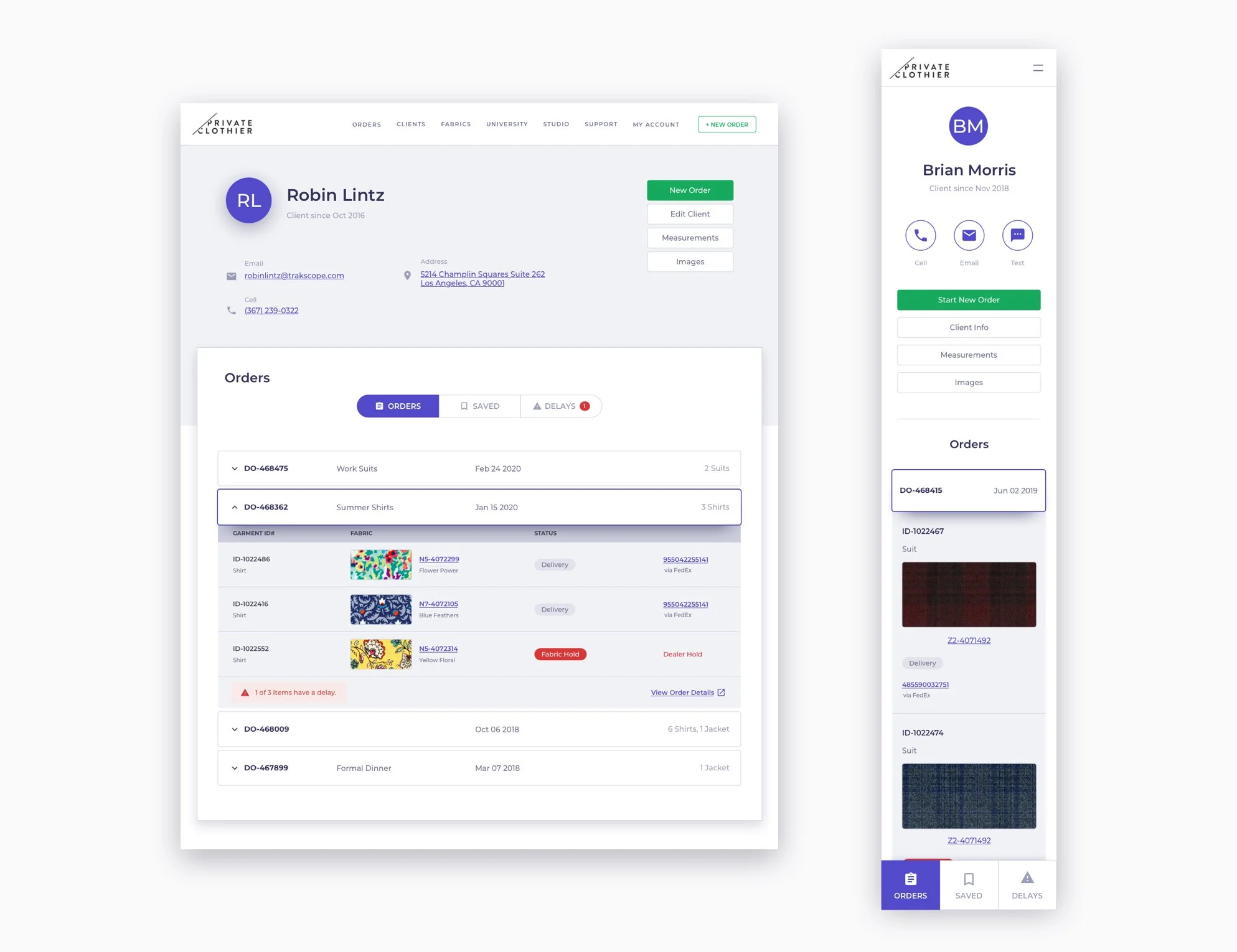
Reusable components helps build recognition and can significantly decrease development time. Remember the client pages we rebuilt in part 1? We modified the orders widget from the dashboard to show a single client’s order history.
The orders widget was reused on client pages to show order history
Dashboard Launch
The omni-search and orders widget launched together as a full dashboard redesign alongside the new client pages. I created a promo video in Adobe After Effects to announce the launch:
Post Launch
A promo video and multiple announcement emails were sent out at launch. Unfortunately, most users didn’t see the email, a clear example of the communication problem we were trying to solve. In addition, the orders menu continued to dominate page views because some users continued to use bookmarks.
DECISION: Break the Bookmarks
Success depended on radically changing user behavior but we couldn’t retrain hundreds of users individually. They needed to see the benefits of using the new dashboard so I suggested we change the order page url pathway from /order_status to /orders and redirect users to the new dashboard if they used the old link. The menu item for orders in the navigation was pointed to the new url so the strategy intrinsically targeted users who used bookmarks. A handful of users were annoyed by the broken links but they embraced the dashboard after we personally reached out and gave them one-on-one walkthroughs. The views for the dashboard overtook the orders page within a week after making this change.
RESULTS
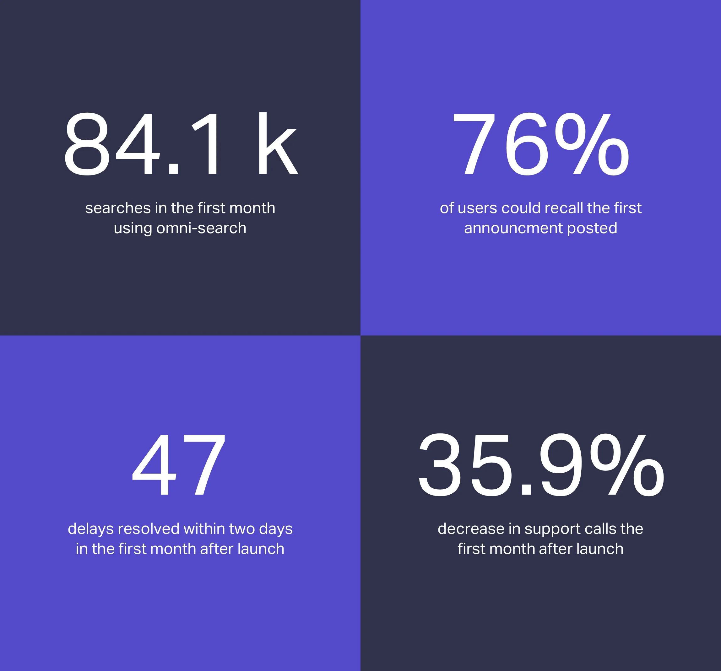
Support calls decreased in number and time invested because users were educated on why certain orders were delayed. The new client pages and navigation were met with positive acclaim. The new announcement section was a success - I contacted 25 users* and an overwhelming majority could recall the current announcement from memory.
* Users who used the dashboard in the last 7 days; randomized


