Trinity Apparel
Fabric Explorer
BACKGROUND
Trinity Apparel is a wholesale made-to-measure suit and shirt manufacturer that partners with many of the worlds best clothiers. When they started in 2002, the custom menswear industry was still using paper order forms and emailing them to the factory in Asia. Trinity developed the industry’s first online B2B ordering platform in 2003, Workflow, that could handle 10k+ options and enabled the mass customization of men's custom clothing.
Clothiers sell garments to retail clients but are not always Workflow users.
Users are clothiers/dealers/assistants that use Workflow to order clothing from Trinity Apparel.
Workflow was built in PHP by a previous contracted tech team. We wanted to update the codebase and the front-end of Workflow (UX & UI) to React so I built a new design system based on Material UI, Dapper.

TEAM

Primary members of the Fabric Explorer team
The primary team for this project included Harper Maddox (CTO, product management), Ryan Stephen (product design, UX/UI), Tyler Franklin (front-end), J.C. Hiatt (front-end), and Billy Conn (back-end).
MY ROLE
This was a 0-1 project for me - Harper and I advocated for the feature and built presentations/mockups to sell the executive team on the idea. Once approved, my role was end-to-end design from conception to research to helping the dev team code (CSS, animations, etc). I supported the marketing team by producing the launch video below. I also mentored a junior UX designer who helped with research and presentation material.
Product Marketing video for Fabric Explore that I made in After Effects.
PROBLEM 1: Online Visibility of Fabrics
Identified with user interviews and industry research
When starting at Trinity, I was shocked to learn their fabric catalog (10k+ fabrics) was not accessible/visible online to users - everything was in physical form. This was puzzling because almost all of our users were familiar/experienced with using B2C online configurators (where all options are accessible).
Why? In the fashion industry, fabrics are traditionally presented as swatch books (organized collections of fabric samples) so that physical attributes (texture, thickness, softness, etc.) can be communicated through touch. Clothing manufacturers (e.g. Trinity Apparel) give swatch books to clothiers to be used with retail clients because they are highly effective selling tools. Clothiers normally have 40-50 active swatch books at any given time.
Takeaway: Users need an online visual exploration tool that allows them to browse, search, and filter fabrics.

Fabric swatch books are the industry norm but are cumbersome and they can’t display real-time information
PROBLEM 2: Real-time Fabric Availability
Identified with user interviews, analytics, usability studies, and ethnographical studies
Physical fabric folders couldn’t show critical real-time information like fabric availability or pricing changes. To solve this, Trinity sent a weekly Excel spreadsheet with the inventory statuses of all 10k+ fabrics and clothiers would physically mark out-of-stock fabrics in their swatch books using red stickers (behavior observed during ethnographic studies).
Takeaway: Users need a way to easily access fabric availability on any device in real-time.
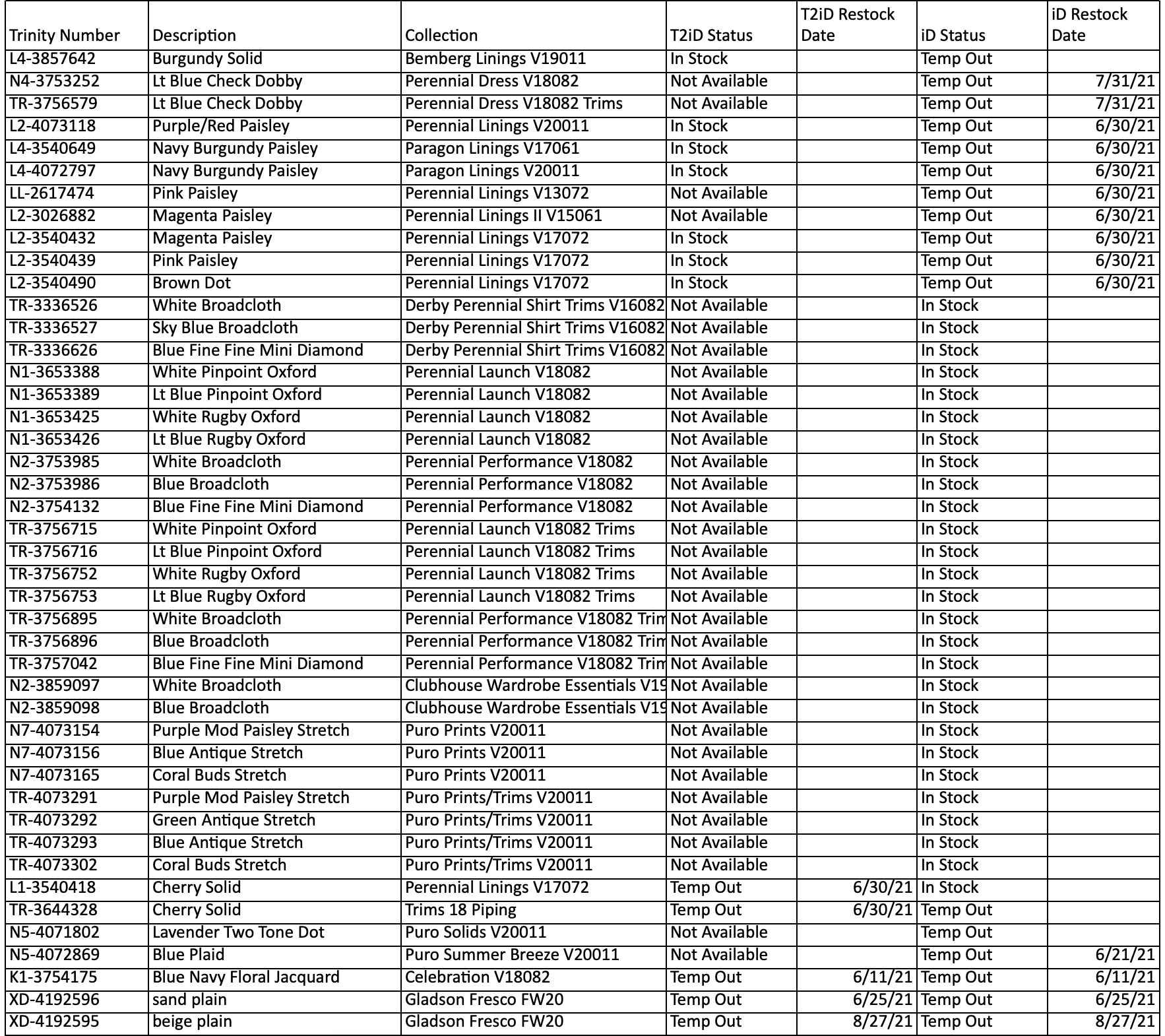
Trinity historically sent a (huge) spreadsheet to clothiers to communicate which fabrics were out-of-stock.

Clothiers tracked availability with a spreadsheet and red stickers in their swatch books
Fabric availability was hurting the business
User interviews revealed a growing number of users, when searching for specific fabric availability, would give up and call the support team because it was faster than looking through their library of swatch books. Prior to 2019, analytics showed that out-of-stock fabrics were the leading cause of delayed orders and there was a 38% chance a client would cancel an order if the fabric they chose was out-of-stock.
“...that Excel file is useless to me, it’s faster for me to just call John and ask if a fabric is out.”
DESIGN
INSPIRATION: B2C E-commerce
We were inspired by B2C e-commerce design patterns because they were familiar to users and they closely matched the experience we wanted for navigating fabrics (e.g. Amazon, Zappos, Banana Republic, etc.). Using existing patterns was also cost-effective because we didn’t have to do exhaustive usability testing - standard components for sorting, searching, and filtering have been optimized and stable for many years.

Components commonly used in B2C e-commerce
USER STORIES: Key to Functionality
User interviews, survey data, and ethnographical studies were used to construct user stories to better understand how features needed to be structured and what information was important to users.
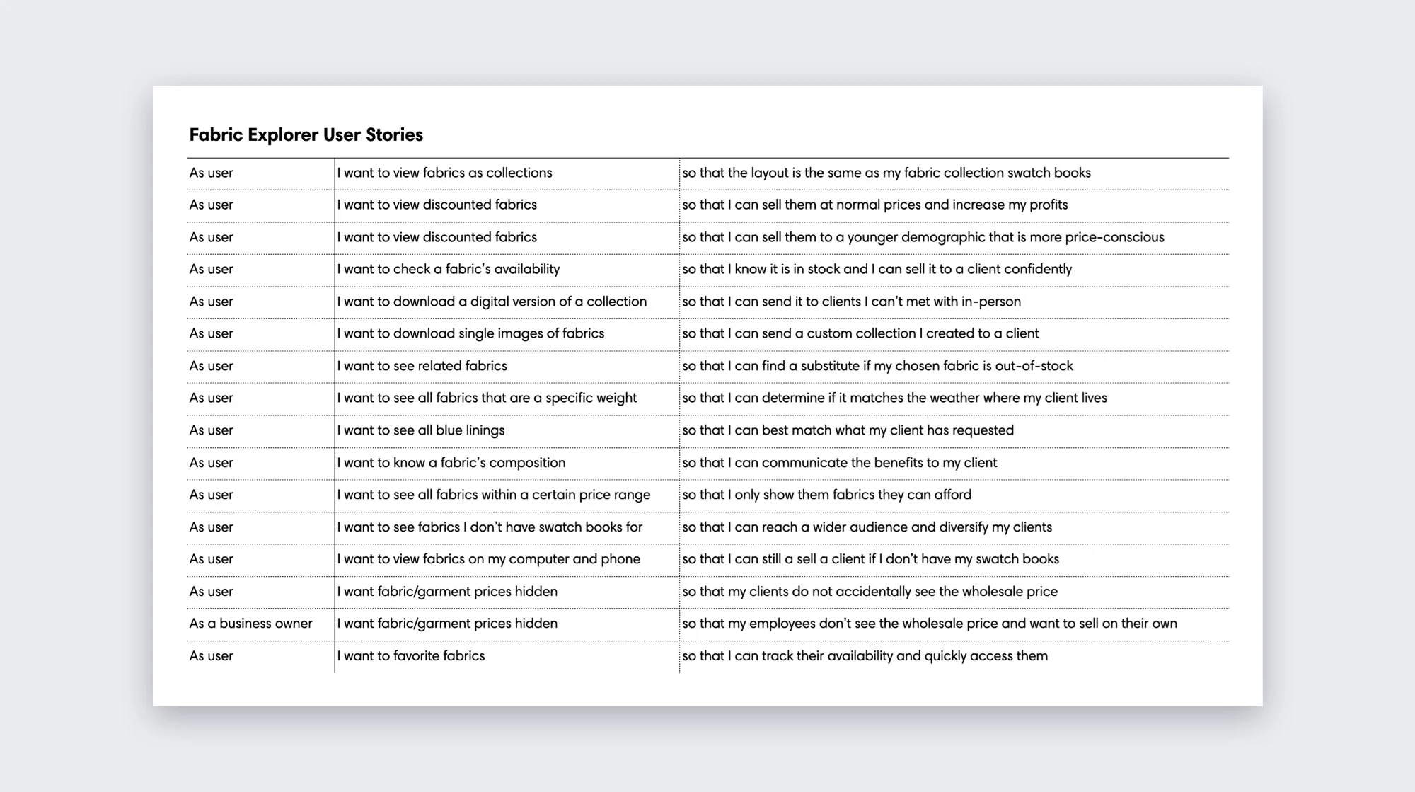
A selection of user stories for Fabric Explorer
USER FLOWS: Basic Functionality
User stories were mapped out as user flows (via Whimsical) to determine what components would best help users accomplish their goals. The marketing team wanted discounted fabrics to be visible from the default page so we decided to use tabs to segment views for collections, discounted, and favorites.
SKETCHES: Getting Started
Using tabs for collections, discounted, and favorites proved to be a problem when combined with search and filters. For example, if someone searched/filtered for “Gray Plaid”, would each tab have separate results or would the tabs simply be replaced by a results section?
Filters were another problem because they were different for collections and individual fabrics. If the user flow was to filter first, they would be presented with both sets of filters and it could be confusing.

Searching across collections and fabrics proved problematic for the dev team
DECISION: Separate User Goals
The problem of tabbed views for collections, favorites, discounted solved itself because our database structure prevented us from being able to do search and advanced filtering between collections and individual in the same search box.
I pivoted the user flow to have collections as the default view with a search box specific to collections. Filters for collections were removed because they didn’t provide enough value and complicated the design. Users looking for individual fabrics were looked at as a different user goal and a new “Find a Fabric” pathway allowed searching and filtering fabrics on a separate page.
SKETCHES: Collection-centric Browsing
Using the v1.1 user flow as a scaffold, I sketched an example of the user goal of finding an individual fabric.

INFORMATION HIERARCHY: Fabric Information
With a user flow in place, it was clear individual fabrics were key to many user goals and we needed to narrow down what information would be shown to the user. We worked closely with the executive team on specific information that needed to be hidden from users to protect Trinity as a manufacturer (e.g. supplier, mill, etc.).
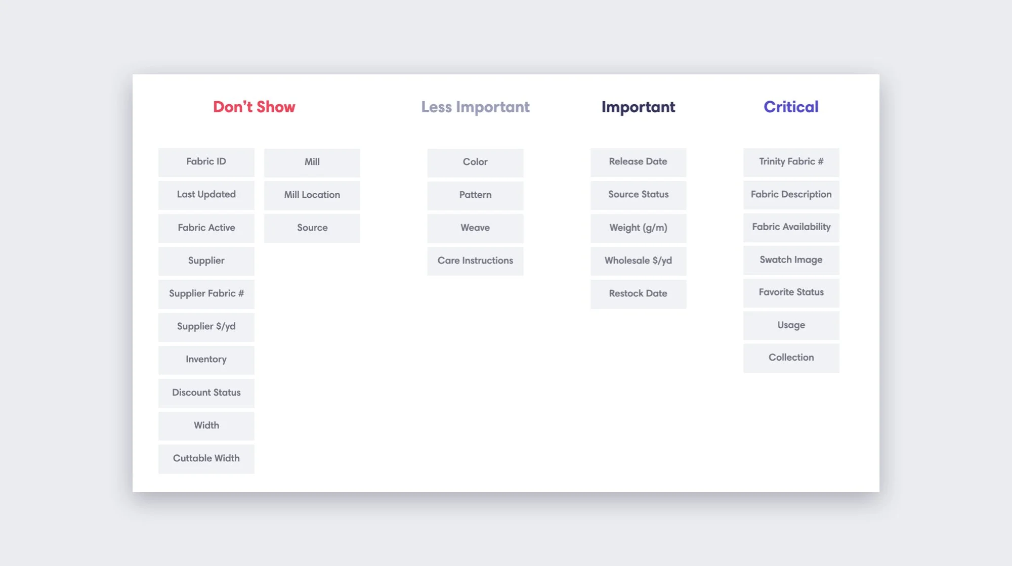
Cards sorting helped narrow down what fabric information should be shown to users
DECISION: Creating Price Categories
Trinity’s pricing model is garment-based - it uses client measurements and historical data to calculate the average yards of fabric needed to make a garment. An audit of Intercom support chats indicated the fabric pricing tables were confusing and that users struggled to give “off-the-hand” estimates to clients.
If we wanted to show pricing, we would have needed to show a mini pricing table on individual fabric pages. Good news, almost all users wanted pricing to be hidden so that their clients/associates wouldn’t see it. But, we still needed a way to represent pricing.
The clothier mental model for fabric pricing (via interviews and surveys) was roughly segmented into four categories: Budget, Good, Better, and Best. Borrowing from B2C, we used price ranges to create four categories of pricing to match their mental model and decrease cognitive load.

New pricing categories based on user interviews
VISUAL DESIGN: Fabric Cards
Predictable containment of all fabric details
Overlay discount % if discount = true
Overlay availability if stock_out = true
Star icon for favorite toggle interaction
Pricing categories for quick guidance
Truncate fabric description if too long

NEW REQUIREMENT: Factory Fabric Availability
At launch, Trinity only had one factory (iD) so the “Out of Stock” banner on the fabric card was easy to understand. About a month after launch, a second factory was added (T2iD) and we had to figure out a better way to show fabric availability at each factory. I created several possible solutions. “Dots over fabric” was a favorite although it was not color-blind accessible because the differentiating element was color (red and green).
Expanding on the “Dots over fabric” design, contextual icons were added to strengthen the visual meaning of the dots and so that interpretation wasn’t limited to color. This addition solved the colorblind problem but subtle changes to the fabric card were needed to ensure readability on all fabrics.

Testing shadows on light and dark fabrics
VISUAL DESIGN: Final Fabric Card Design
Text shadow and an inner shadow over the fabric were applied and provided enough contrast that the factory name was readable on both light and dark fabrics.
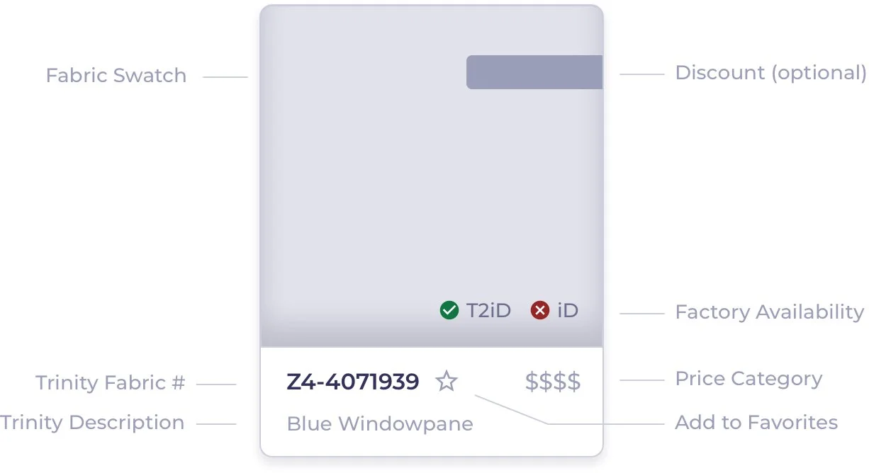
Final fabric card design with factory fabric availability
VISUAL DESIGN: Collections Page
For consistency, cards were also used to display collections. Collections are the default view and how users browse fabrics in real life.
Thumbnails for collections mirror colors/text of physical fabric swatch books (fixed size)
“My Favorites” to easily group and track fabrics across different collections
Truncate collection name if too long
“Find a Fabric” button looks a little odd on mobile but it was too prominent as a full width block element. On mobile, I would have preferred to have the search field animate out after tapping an icon search button but the team felt it was unnecessary.
DECISION: Filters and Search
On desktop, filters were fixed on the left so that they were always accessible and in a edge-slidable side drawer on mobile. We debated internally on the best user experience for how search and filters interacted with each other and concluded they should work independently where one doesn’t reset the other. Usability tests later confirmed that this assumption was inline with user expectations.
LAUNCH
Product Marketing: Launch Video
I created a promo video in After Effects to build hype for the launch with users.
Analytics: Three Months after Launch
Workflow users are typically slow to adapt to new features (older demographic) so we were pleased that 64% of users had favorited at least one fabric. The total fabric searches was also higher than expected, thanks to a small group of power users that integrated Fabric Explorer into their workflow early on.

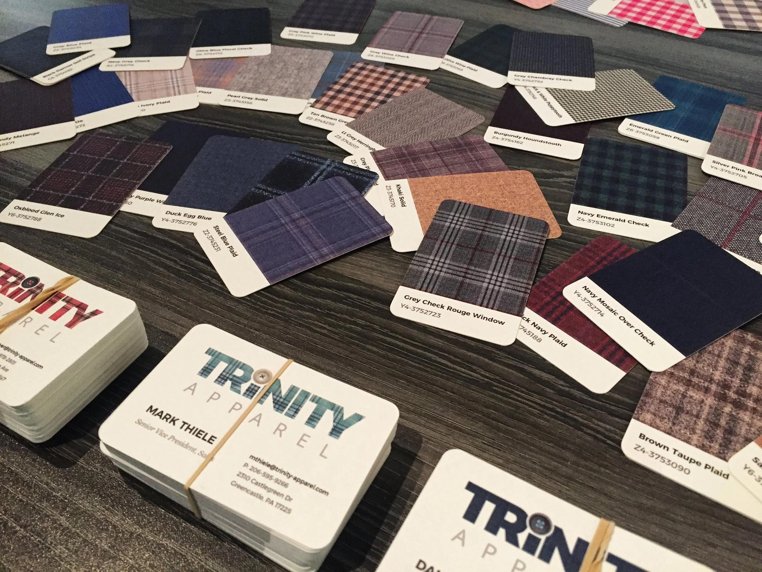
BRANDING
I am a huge advocate of combining digital elements with branding to build recognition and strengthen the brand/product relationship. Trinity needed new business cards but I didn’t want to use the old designs because they lacked visual appeal. To celebrate the new UI and visual design, I extended the fabric card component into the business cards and utilized moo.com’s feature that allows 50 unique designs to be uploaded for the back of the cards. The cards were 18pt and printed on 100% recycled cotton paper from old t-shirts so they even had a fabric-y feel.
The fabric team was ecstatic.