
Trinity Apparel
Workflow Dashboard
Part 1: Omni-search
Please view the product marketing launch video I made in After Effects if you want a quick overview of this project.
BACKGROUND
Trinity Apparel is a wholesale made-to-measure suit and shirt manufacturer that partners with many of the worlds best clothiers. When they started in 2002, the custom menswear industry was still using paper order forms and emailing them to the factory in Asia. Trinity developed the industry’s first online B2B ordering platform in 2003, Workflow, that could handle 10k+ options and enabled the mass customization of men's custom clothing. Workflow was built in PHP by a previous contracted tech team.
Clothiers sell garments to retail clients but are not always Workflow users.
Users are clothiers/dealers/assistants that use Workflow to order clothing from Trinity Apparel.

Sadly, Workflow didn’t have any significant updates until 2019. The UI/UX was dated and it was difficult to use, especially on mobile (non-responsive). Users had become accustomed to responsive e-commerce experiences like Amazon and Overstock.com and were frustrated with the lack of updates.
As a newly-formed tech team, we started rewriting the front-end of Workflow in React using a new design system I developed, Dapper.
TEAM: Harper Maddox (CTO, product management), Ryan Stephen (product design, UX/UI), Billy Conn (back-end), and Tyler Franklin (front-end).

Core team for the Workflow Dashboard redesign
RESULT: An omni-search that quickly connects Workflow users to information they need with minimal cognitive load.

OPPORTUNITY: New Experience
The dashboard (or homepage) is the first screen users see after signing into Workflow so it is incredibly important to the user experience. Over time, the dashboard became a cluttered catch-all of afterthoughts and collectively, lacked a cohesive goal. The rewrite gave us an ideal opportunity to explore a new visual language and reimagine the user experience from the ground up.
BUSINESS REQUIREMENT: Communication
Trinity was struggling to communicate with users - email open rates were low and users rarely interacted with the bulletin board. Users were missing important announcements and calling the support team in panic every time an update was made. As a business requirement, the dashboard redesign needed to include a way for users to access news and company announcements.
DECISION: Removing Messages and Rewards
The accordions for Messages (info for delayed orders and payment details) and Partnership Rewards unnecessarily complicated the page. Messages violated usability heuristics (visibility of system status) because crucial delay information was hidden from the user. For the new design, the content in Messages was integrated into an orders widget and Rewards was moved to its own page because it wasn’t a primary user goal (confirmed with interviews and survey data).
RESEARCH
Analytics showed that users spent only a few seconds on the dashboard before moving to internal pages. The Orders page, where all orders and item production statuses were displayed in a table, had significantly higher page views than the dashboard.
It was clear users were bypassing the dashboard for a lower investment pathway.

Dashboard analytics before redesign
User Interviews over the phone and at industry shows helped us better understand how the dashboard was used and gather suggestions from users who had been using Workflow for many years. The majority of users were frustrated and dismissive when asked how the dashboard helped them achieve their goals.
Interestingly, an alarming number of users navigated Workflow using only bookmarks.

The orders page required search parameters and was not responsive for mobile
INSIGHT: Learning Bad Habits
It was suspicious how many users utilized bookmarks to navigate Workflow. While attending an industry event, I discovered that our sales team trained users to use bookmarks because they were easier to read than the actual navigation (old PHP) and bookmarks worked better on mobile.

Users were using bookmarks almost exclusively to navigate Workflow
As terrible as it was, the sales team was right. They couldn’t fix a non-responsive, dated navigation (with handwritten font for navigation titles!) on their own but they could influence user behavior to bypass the problem, giving users the best experience available at the time.
The redesign needed to quickly connect users to detailed information and provide greater value than bookmarks.

Mark Thele at a Workflow training event in Chicago. (photo: Ryan S.)
SOLUTION: Navigating to Top-level Pages
The sales team wanted on-page quick links for top-level pages (e.g. orders page) but I strongly disagreed. I felt the smarter long-term solution was to make the site navigation readable and responsive, not create an alternative navigation that took up space on the dashboard.
After some discussion on scope creep, we decided to rebuild the header in React and launch it with the new dashboard redesign.

I redesigned the header so that users could easily access top-level pages
SOLUTION: Navigating to Sub-pages
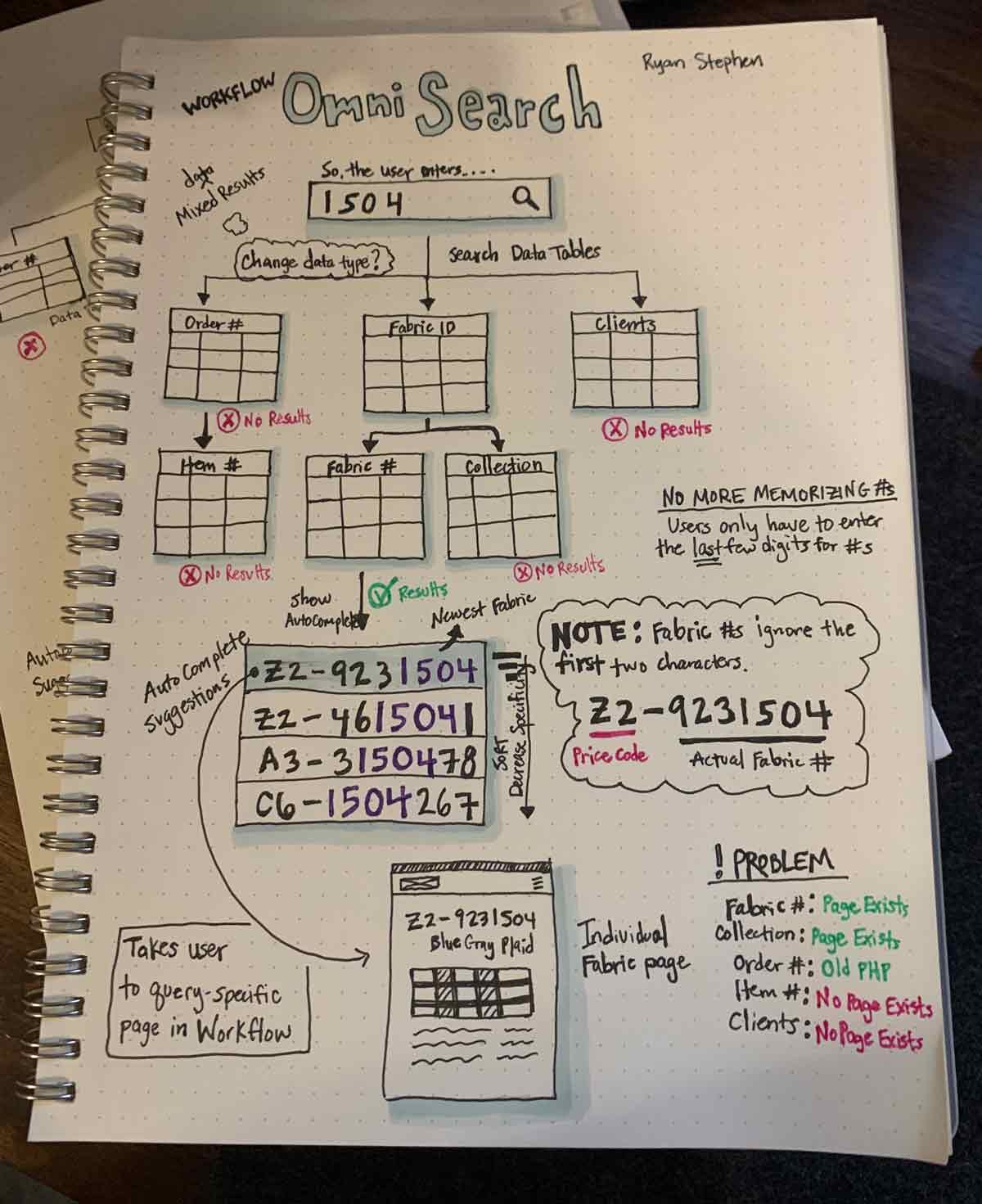
An omni-search at the top of the page was an ideal solution to help users navigate to sub-pages in Workflow. Omni-search has gained popularity with companies like Google, Spotify, and Twitter because it is lightweight and an intuitive way for users to access different types of content using a single search input. The functionality is simple: enter a small amount of information, get autocomplete suggestions, and click a result to go directly to a detailed page.
DEFINE: Searchable Content
We needed to determine what entities (content types) users might search for because the omni-search couldn’t cover anything and everything. Inspired by user interviews, a survey was conducted (n=62) which gave us a quantitative break down of why users logged into the system multiple times a day.

Primary reasons users sign in by volume
We expected the volume of visits to be low for placing orders because users typically enter orders in bulk when they have blocks of free time.
Ethnographic studies demonstrated that users anxiously monitored order statuses throughout the day because they were trying to coordinate in-person fittings with clients as soon as their garments arrived. Estimated delivery times were added to the feature backlog.

Relative user emotional states when accomplishing primary tasks
User stories and card sorting helped me identify four entities (content types) that covered 75-80% of user goals:
Orders
Items
Fabrics
Fabric Collections
Clients

Example user story for fabric availability
DESIGN
SKETCHES: Single Input Field
Omni-search uses a single input field to search through several data tables at once but some restrictions were needed to protect users from each other. As a business requirement, users could only see orders, items, and clients that were in their account.
Early sketches for searching fabric numbers
DECISION: Search Results Page
There wasn’t a need for a separate results page (like Google) because the searchable attributes in v1.0 were very specific, making it was easy for autocomplete to suggest the right result. Also, an intermediate results page would slow users down and it could cause a negative experience for users with very few clients and/or orders.
DECISION: Partial Search
Search was covering only a handful of data tables so users only needed to enter the last four digits to get relevant autocomplete suggestions. This was praised in user testing as a game changer because users were previously required to enter numbers in order as they appeared. We set autocomplete to trigger at three characters.

Partial search minimized the number of key strokes
DECISION: Placeholder Text
During usability testing on larger screens, users were confused by the placeholder text “Search....” and incorrectly assumed they could search for anything using full sentences - an affordance we attributed to Google. We corrected the mistake by making the placeholder text explicit in the next iteration.

Results for open and explicit placeholder text
DECISION: Icons for Mixed Results
“Ken” could return both a client (Ken Smith) and a fabric collection (Kensington) so we needed to visually identify the content type of each result. Contextual icons were added in the next iteration.
Orders and Items were combined because they shared the same destination (order detail page).
Icons helped to visually differentiate types of content in a mixed list
DECISION: Visual Design
The design strategy was to minimize visual weight at resting but have a highly informative autocomplete when activated. A big soft shadow allowed the input field to pop on the page with a thick colored outline when in focus. Users found the shape of the input field most inviting and familiar when it had a round border radius like google.com.
Primary attributes (i.e. Allen Hupp) in the autocomplete used a dark color with the exact search terms bolded. Secondary attributes were lighter to visually deemphasize importance. A nice addition was that users no longer needed to memorize order or item numbers, they could simply type a client name and identify the order by its secondary attributes.

Basic omni-search functionality for different user queries
The design worked well for large screen sizes and employed graceful degradation principles on mobile. The primary attribute was the most important to a user so I simply truncated the secondary attributes in the autocomplete list and shortened the placeholder text when at rest.

Fixed width attributes were predicable and could accommodate secondary attributes that had variable widths
SCOPE CREEP: Destination Pages
The general design pattern for search is to enter a query, get a list of results (page or autocomplete), and then navigate to a more detailed page. Ideally, our users would be sent to new React pages after clicking a result so that the user experience was consistent but we only had the old PHP pages for clients, items, or orders.
We only had enough time to rewrite one so I prioritized the client pages because we planned on building CRM features and the new client page design could potentially prime users for future feature adoption. For the time being, orders and items would link to old PHP order pages.
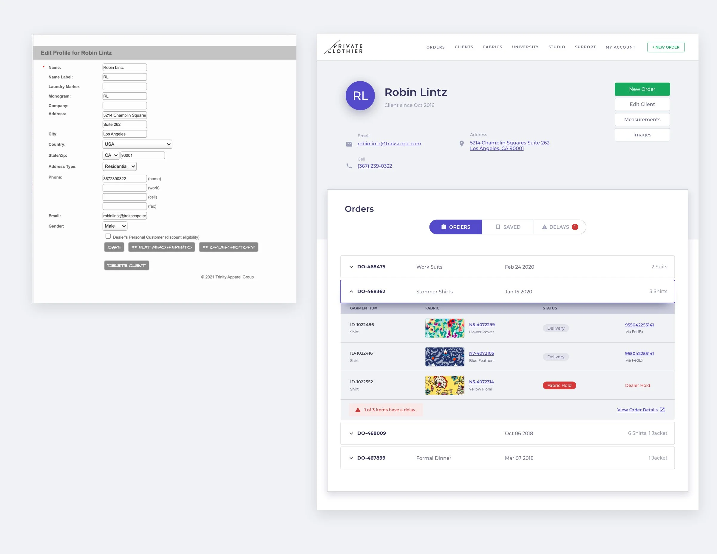
Old client pages (left) were simply the edit/write mode. The new design (right) was meant to resemble modern CRM platforms.
DECISION: Announcements Area
Inspired by Google once again, the area directly below the search field was an ideal location to tuck a single text announcement or a visual banner to maximize visibility. A slider allowed users to cycle through past announcements and clicking on the announcement opened a modal containing the original email content.
User testing proved that users, who were given unrelated tasks to accomplish, could accurately recall announcement topics after being idle for five minutes.

The most visible location for an announcement was below the omni-search
PART 1 COMPLETE
Adding an omni-search to the top section of the dashboard helped users dive quickly into detailed sub-pages and provided an effective mechanism for communicating company announcements however, an additional component was needed to ease the burden of monitoring order statuses. In Workflow Dashboard Part 2: Orders Widget, we built a hybrid table component to solve that problem and help users resolve delayed orders.
“This new direction is fantastic and I can’t even express how happy I am that it works on my phone. ”