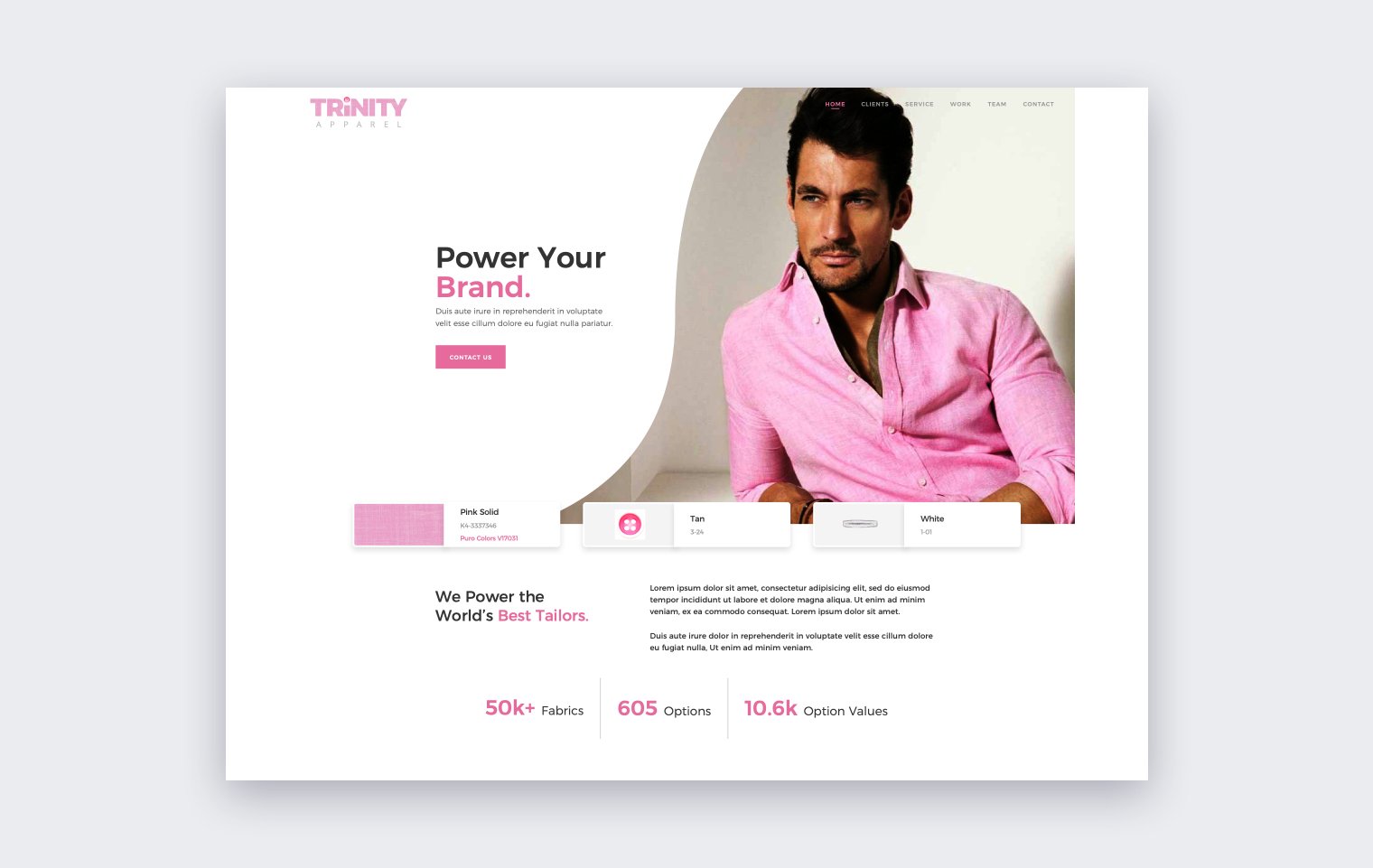
Trinity Apparel Rebrand
Previous branding was broken.
In late 2018, I was busy redesigning Trinity Apparel’s B2B ordering platform (Workflow) and developing a new design system because the current UI was dated and extremely confusing for new users. The philosophy of the rebrand was to simplify user flows, use natural language, and make UI easier to understand but this was directly opposite of the brand messaging at the time. Trinity Apparel was known as three different companies - The legal name was Trinity Apparel, the sales team registered/marketed at shows as iDesign, and the company email was john@idpbp.com, which was an acronym for iDesign Private Branding Platform. Each brand entity also had its own website and logo but the sign in all went to the same B2B ordering platform. It was a mess.
Why rebranding the company was important to the product.
Launching a new redesign of Workflow under those branding conditions felt out of sync and it lacked a higher-level, holistic goal of unifying the brand with the UI philosophy. In product design, we worry so much about the user experience but forget (or ignore) the overall customer experience and how users feel about the brand. For some users, the app is the brand. In Trinity’s case, the UI philosophy needed to match the brand and the only way to do that was from the top down.
REBRANDING CONCEPT
I presented a rebrand concept to the executive team and the following images are slides from that presentation.
Conclusion
The executive team agreed that the branding did not match our product ambitions and gave the green light to start rebranding the company. I redesigned the website, marketing emails, email signatures, and stationary to reflect the new branding. We officially rebranded at the beginning of 2019 and the change was a strong message to the users/dealers because it showed them that Trinity was on a new path, one that supports personalization and simplicity.
With the rebrand complete, we focused on product releases like the Workflow Dashboard and Fabric Explorer.


